Copenhagen Fashion Week SS27: What 3 Brands Teach Us About Branding
Fashion week coverage tends to begin with silhouettes and end with a verdict on whether ballet flats are back. Useful, perhaps, if your most urgent concern is the future of your ankles. From a branding perspective, however, the more interesting question is simpler: if the clothes disappeared, would anyone still know whose show they were watching?
At Copenhagen Fashion Week SS27, Baum und Pferdgarten, Marimekko and Stine Goya offered three very different answers. One built a story from contrast and converted it into collaborations. One treated its visual identity as an entire landscape. The third turned a collection into a cultural argument involving Expressionism, Stravinsky, Kafka and the unease of the AI era. Nobody can accuse Copenhagen of merely sending beige tailoring down a concrete corridor and calling it a concept.
What makes the trio worth examining together is not that they share an aesthetic. They do not. It is that each show behaved like the brand behind it, and while it may sound obvious, fashion marketing regularly spends enormous sums proving otherwise.
Baum und Pferdgarten: contrast is not a theme, it is the operating system
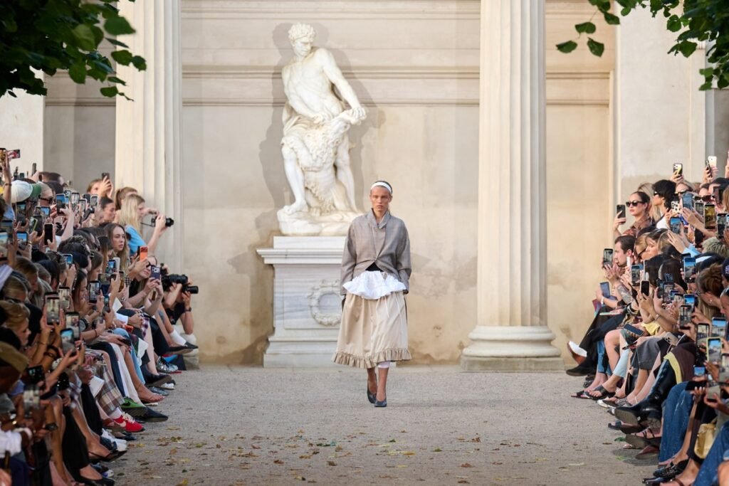
Baum und Pferdgarten called its SS27 collection After the Rehearsal, with the story based in the slightly untidy space between performance and ordinary life. Ballet references were clearly visible in belt skirts, lace, bows and lace-up details, while sweatshirts and sweatpants appeared for the off-duty part.
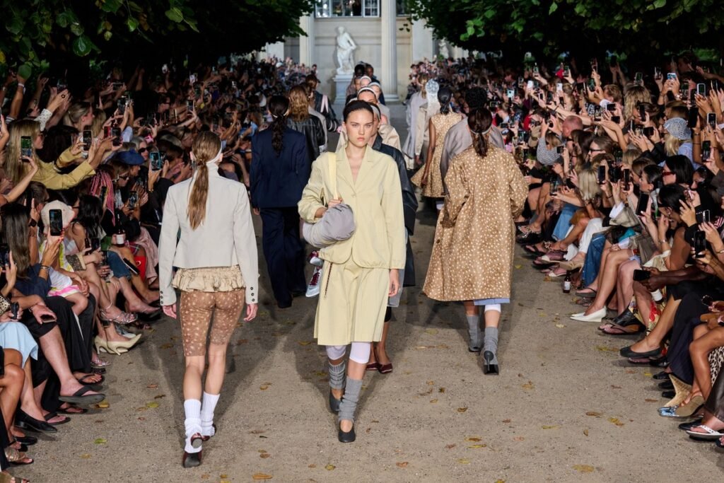
The open-air show in the King’s Garden, a formal, historic Copenhagen setting, featured models alongside friends of the house and new faces, making the presentation feel like an expanded version of the brand’s own community.
More importantly, Baum did not leave the concept stranded on the runway. The brand introduced a six-style footwear capsule with Pretty Ballerinas, returned to Swedish Stockings for two color-matched hosiery styles and showed a runway-exclusive T-shirt intended for immediate online sale. In marketing terms, this is where the storytelling starts earning its keep.
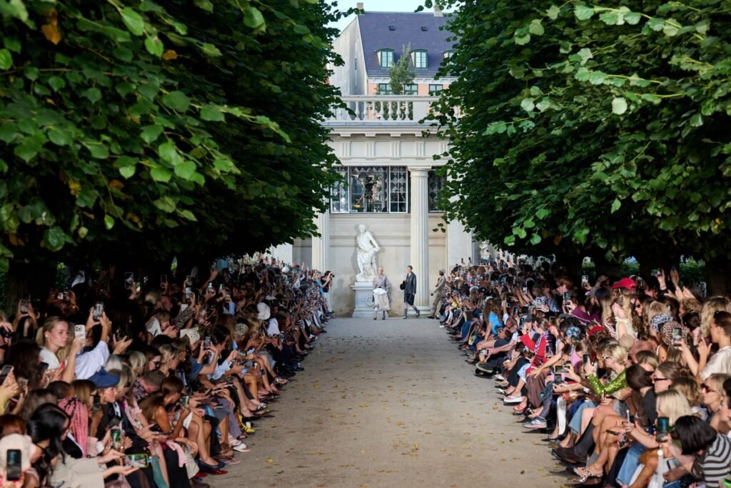
It is also familiar territory for the house. Its recent collaboration history includes retro sneakers with Etonic, a uniform and ongoing sponsorship for the B.93 women’s football team, and hosiery with Swedish Stockings. The pattern is consistent: take something functional or overtly sporty, then complicate it with the brand’s feminine, playful visual language. The partner contributes expertise and credibility; Baum contributes the twist.
Marimekko: when colors become the brand
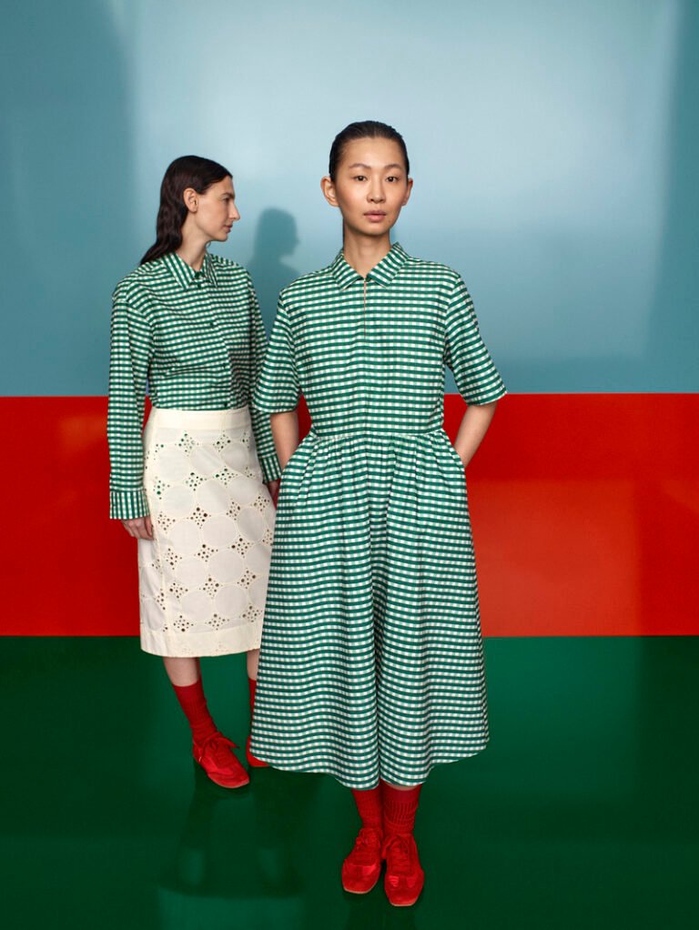
Marimekko, a Finnish design company renowned for its original prints and colors, came to Copenhagen with a different advantage: owning visual assets strong enough to do the introduction before the press release begins. They transformed a concrete communal dining table on the rooftop of the historic Langelinieskuret into a runway, while the SS27 theme, The art, the artist, and the landscape, was delivered through recognizable colors, abstracted florals and stripes, and forms inspired by desert terrain.
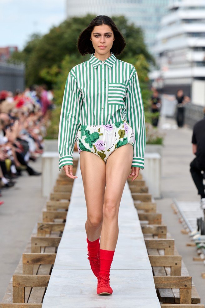
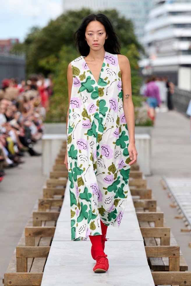
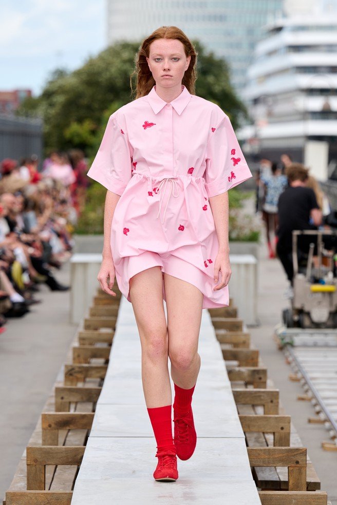
The collection introduced Akkorder, a new striped print by Danish textile artist Vibeke Rohland, alongside floral designs by Erja Hirvi. Yet the important brand move was not simply adding more patterns to an archive that already contains more than 3,500. Marimekko repeatedly turns printmaking from a product detail into a public experience.
It’s interesting that the brand always makes an event out of their presentation; for example, Marimekko Day was held at Helsinki’s Esplanade Park with open-air fashion shows and live performances. At Milan Design Week 2026, the brand created Osteria Fiori di Marimekko, mixing print, food and Finnish-inspired aperitivo culture. Its collaborations extend the same recognizable graphics to categories such as CASETiFY tech accessories: different formats, same brand handwriting.
This is not accidental, as Marimekko’s strategy is to scale internationally as a lifestyle design brand renowned for bold prints. This is why runway has several jobs: it presents a collection, creates media imagery, reinforces a distinctive asset and introduces audiences to the wider Marimekko world. The brand’s SS27 page moves neatly from show content to its app and Friends of Marimekko membership. Inspiration, data capture and commerce are not treated as separate departments who happen to share a logo.
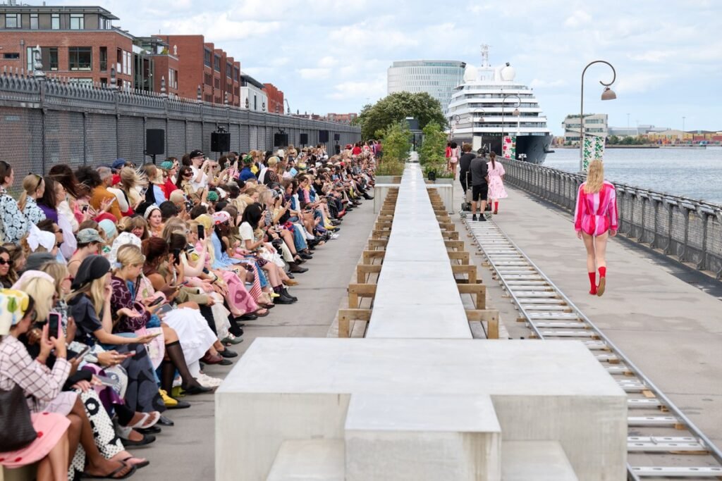
Some brands make a mistake of chasing novelty so aggressively that each campaign requires a fresh introduction, while Marimekko can afford to vary the composition because the core ingredients remain unmistakable. Their playful prints can be found on clothing, furniture, a restaurant, a city park or the low-resolution rectangle of an Instagram Story and still feel like Marimekko.
Stine Goya: selling clothes by building a cultural world around them
Stine Goya returned to the official Copenhagen Fashion Week calendar after two years away with Before, a collection inspired by Florian Illies’ book 1913: The Year Before the Storm, with a look back at a moment when artists, writers and thinkers worked in unusual proximity, creative movements collided, and Europe stood on the edge of a future it could not yet see.
Goya found a way to give their own critique of the present we are currently in: political and cultural instability, uncertainty about what is true and AI’s disruption of our sense of reality. Expressionist landscapes became jacquards, floral bouquets were dismantled and reconstructed, and frames appeared as linings, embroidery and crystal outlines around the body. It is an ambitious amount of intellectual luggage for a fashion show. Stravinsky, Malevich, Proust and Kafka all make appearances in the press materials, which is at least a refreshing change from describing a hemline as ‘timeless yet modern’. There is always a risk that cultural references become expensive decoration, but this one belongs to a longer pattern in Stine Goya’s branding.
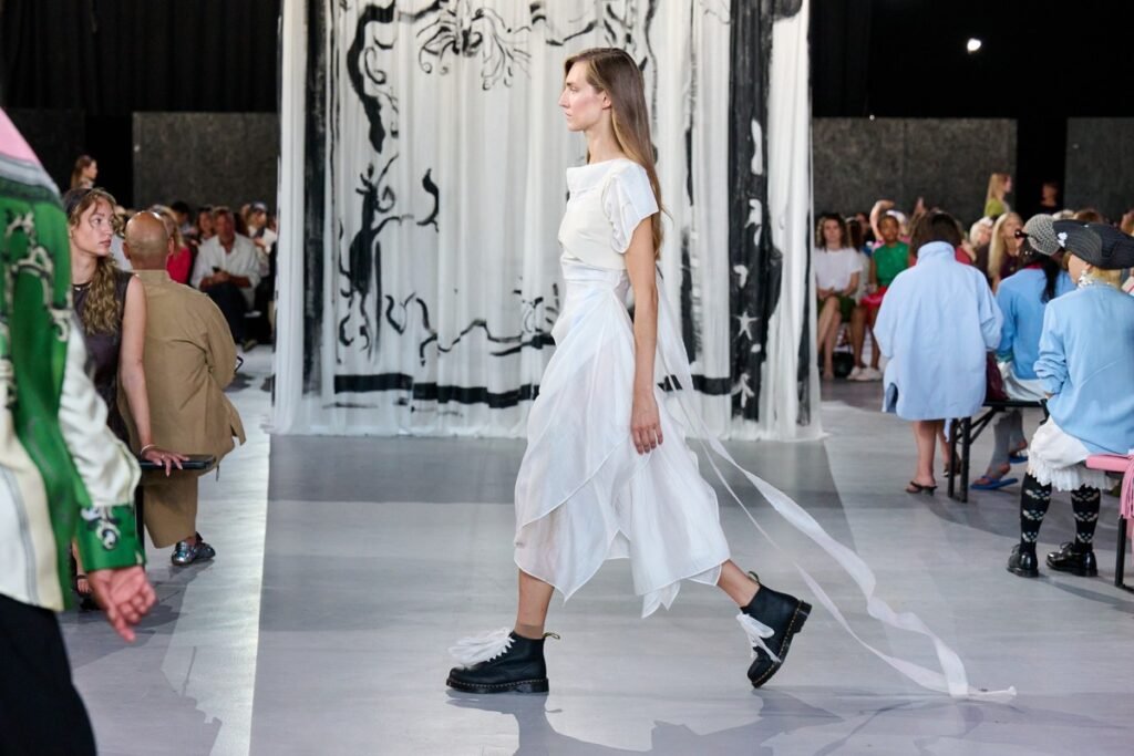
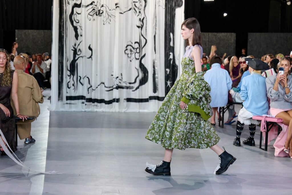
The brand has consistently positioned itself as the colorful alternative to muted Scandinavian minimalism, drawing from art and design while using hand-painted prints as a recurring signature. Its AW25 collection was presented at Kunsten Museum of Modern Art Aalborg alongside If You See What I See, an exhibition personally curated by Goya. Its customer program is called House of Goya, framing membership as entry into a community rather than enrolment in a discount database, even though, sensibly, there are benefits and sales involved.
Before it pushes that strategy further, without using art to make the clothes look cultured, the show asks the clothes to participate in a cultural conversation. This was a much harder position to execute, but also a more defensible one, as color is easy to imitate, but a coherent point of view is not. For Stine Goya, that world includes Copenhagen color, art institutions, creative communities, and now a historical metaphor for living on the edge of change.
Consistency does not mean repetition.
Taken together, the three shows offer a useful correction to the way brand consistency is often discussed. Consistency is not using the same template but making new decisions from a stable point of view.
Baum und Pferdgarten used contrast and collaboration to turn an idea into a product; Marimekko stayed consistent with its visual language across fashion, space, culture, and commerce, while Stine Goya built meaning through art, narrative, and community. These three brands show us that the test for any brand isn’t whether its latest campaign looks good, but whether the idea could belong to anyone else. If the answer is yes, it may be content. If the answer is no, you are probably looking at a brand.